
This article appears in the Encyclopaedia Britannica Yearbook of Science and the Future 1993, pp202-219, ISBN 0852295685. The published article has additional illustrations, and was edited from this one -- so there are minor differences.
Pushbutton gadgets are difficult to use and frustrating. It's even more frustrating to know that with a bit of thought they could be made much easier and safer to use.
"A lorry driver who killed five people when his vehicle crashed into stationary traffic near Darlington, Co Durham, while he was fiddling with his CB radio was given a non-custodial sentence" (Independent, May 21, 1992)
President Bush set out to master new technology with his first lesson on a new White House computer, but he wasn't setting his goals too high. "I don't expect this new tutorial to teach me how to set the clock on the VCR or anything complicated." (Daily Telegraph, December 30, 1991)
IT WAS 1930 and the famous physicist Otto Stern had a visitor to his complicated laboratory in Hamburg. The visitor remarked that there were rather a lot of controls on the apparatus he used. Stern replied that it was a pity that humans had not kept the prehensile tails that were lost millions of years ago, as they would have been useful in the laboratory now. The visitor answered back, "They wouldn't help you, Stern; you would just make your apparatus still more complicated!"
Today we live in a "pushbutton world" and it seems as if the people who built it had prehensile minds. We live with things we do not know how to use. At worst it is dangerous -- somebody may press The Red Button by mistake. At best it is frustrating. The purpose of this article is to explore the state of this technology that is making our lives complicated. There is a science of design underlying machines for people to use; in the 1990s we have reached the point where we need to start applying it with urgency. The frustration we all have with over-complex gadgets has to be understood as a failure to apply science to make the things properly: it is not our failure because we are too old or too simple-minded.
The number of buttons on my video recorder (VCR) and television remote controls is 105 (55+50), more than an ordinary computer keyboard! In other words, computers, far more complicated things than VCRs and TVs, can be controlled with far fewer buttons; indeed, the Apple Macintosh has made a point of being operated with a mouse, or "screen pointer," with a single button. Everything a mouse can do can be done by five ordinary buttons: four to move in each direction and one to indicate a "hit." If we add a further control for switching on and off, we make a grand total of six (Figure 1). The point is that having many buttons does not in itself make things easy.
With only six buttons, against over 100, each button is used more often so the user is less likely to forget what it does. Everything the user wants is shown by menus (choices of what can be done) on the TV screen. The user moves around the menus on the screen and selects what is wanted. Menus mean that the user can see all the possible functions the VCR and TV can do; unlike physical buttons, menus show nothing confusingly irrelevant when some particular function happens to be unavailable.
Figure 1. A remote control that can do everything. Note that On/Off is a slider rather than a button.
Many designers use the Macintosh as a quick way to simulate new product designs without having to go to the expense of building a prototype (Figure 2). That a Macintosh, used with as simple an interface as a mouse, can simulate any pushbutton gadget is proof that domestic pushbutton gadgets have taken an altogether different and worse path.
TVs and VCRs are the most frequently used home pushbutton gadgets, but they are not the only ones to suffer from problems. The microwave cooker has twenty buttons. The CD player has more. If you can't press the correct buttons in the correct order on the burglar alarm it will deafen you! Most of these systems have infuriating digital clocks. The standard joke is that you can tell a house with no teenagers because the digital clocks are all flashing the wrong time. (Clocks will be discussed at greater length later in this chapter.)
We take our buttons with us into the car. In-car entertainment systems have aspirations to simulate concert hall, church and disco sound environments -- chosen at the touch of a button (the correct button). A typical car radio now has over 25 buttons, almost identical, and a small display that shows writing only 1.5mm in height. A car driver cannot be expected to read the information shown on his car radio and drive safely; yet these things, regardless of their danger, sell well.
Although the mentality that designs car radios and VCRs also designs nuclear power stations and aircraft cockpits, there is an important difference. Power station operators and pilots are highly trained (and as Three Mile Island reactor failure showed, even that won't be enough when the machinery is badly designed), whereas car drivers are not specially trained in operating complicated car radios!
At work, we have to face photocopiers and FAX machines that just say ERROR, but don't tell you what the error is (or even whether it is you or it that has made the error). Then there are telephone systems with HOLD and DIVERT and more. On standard telephones having the ten digits (0 to 9) and the two symbols # and *, a function like DIVERT might be activated by pressing *#1. Such sequences are especially hard to remember just when you need them. Conversely, telephones with a dedicated DIVERT button probably don't divert!
Tedious as this list of frustrations is becoming, next year it will be longer. Why is life getting like this? Why doesn't the advanced technology -- of which there is no shortage -- seem to help at all?
The first part of the answer is that gadgets covered in buttons sell better than gadgets that look simple. If you have just paid a month's earnings you want to see a few buttons for it and a long "feature list" to out-count your neighbour. The marketplace emphasises styling, what things look like, rather than how they work inside. You only find out whether something is easy to use well after you have been seduced in the shop. Some features you may not explore until weeks after you have bought the system; and what happens if you don't understand them then? Timeouts (the technical term for impatience) cannot be "seen" until they directly affect what you are doing, but they can make what you want to do impossible.
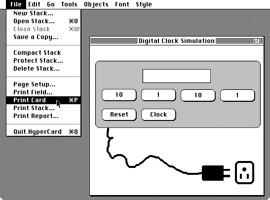
Figure 2. The screen of a Macintosh computer simulating a design for a digital clock (shown to the right). This clock actually works when it is plugged into the electric socket. To the left of the picture is a menu of choices, pulled down from the top line. Here the designer is pointing to the choice Œprint card¹ which would print a paper copy of the simulation, perhaps to show a client. The arrow can be moved around, up and down, to select other choices as required; for example, moving down to the last line and selecting that choice would quit the simulation program.
The screen of a Macintosh computer simulating a design for a digital clock (shown to the right). This clock actually works when it is plugged into the electric socket. To the left of the picture is a menu of choices, pulled down from the top line. Here the designer is pointing to the choice print card which would print a paper copy of the simulation, perhaps to show a client. The arrow can be moved around, up and down, to select other choices as required; for example, moving down to the last line and selecting that choice would quit the simulation program.
This chapter will argue that there is plenty of science that could be applied to improve usability and reduce our frustration. Well briefly cover some of the principles that get overlooked in the design process. It is hard to believe that bad design is not deliberate.
If science drove design, what principles would it espouse? There are three main areas that can easily contribute principles for better design: ergonomics, computer science, and plain common sense.
Ergonomics (also called human factors) is concerned with how humans operate. An ergonomist would question the readability of car radio displays. The text is too small, block capitals (which are harder to read than lower case), and on some systems it flashes -- it may not even be visible when the user tries to look at it!
Knobs are for turning, buttons are for pressing, switches for flicking, sliders for sliding. Different control styles have different affordances, giving useful clues to how they work. When controls feel different, this aids the user in operating the right one without looking, without diverting attention from driving. Unfortunately with the increase in digital electronics everything is being controlled by buttons. Buttons are either pressed or not pressed, and appeal to the binary (0 or 1) mentality of unsophisticated programming. Your VCR has a binary computer in it, but what has that to do with how you operate it? Only that it is easier for the designer than to do a decent job.
Many gadgets have functions that the designers have decided to make harder to do. To record on a tape (which might accidentally erase what is already on the tape) you may have to press two buttons. The manual for my cassette recorder shows two fingers coming from opposite directions in order to press two buttons simultaneously. I don't happen to be made like that! Its clearly an ergonomic oversight of major proportions.
One manufacturer has noticed this problem and their recorder has a button so that it can be "conveniently" set to a permanent record mode -- so you can wreck more than one tape before you work out what is going wrong! Thus marketing encourages "solutions" to specious problems, ever-lengthening "feature bouquets" to upstage the competition, and extra buttons to camouflage problems people complain about. If designers really wanted to add extra buttons to make things easier to use, they wouldn't add more buttons for new functions but would add them for better aids for working: buttons like HELP and UNDO or CANCEL being the ones most needed by users. Or they would add verification so that button pressing is checked for being sensible. My VCR will uselessly accept mistaken instructions to record something yesterday. VCRs should (and could very easily) verify that recording dates and times are plausible and, when they are not, point out the problem before it is too late.
The clarity of manuals leaves much to be desired, and this is a particular concern of ergonomics: readability. Manuals are incomprehensible, suffer in the translation, and assume you want to know about the functions of the gadget, rather than things you can do with it. Before you can use the manual you have to know the technical term for the function you want. In ergonomics jargon: manuals are function-oriented (telling the user about the functions and buttons provided) but they should be task-oriented (helping the user do what things, tasks, they want to do).
Such principles are basic ergonomics; there is little excuse to ignore them. Ergonomics has a more fundamental principle: that designers tend to design for themselves unless they make a conscious effort to design for users. If you are an electronics engineer, there is nothing more obvious than a few buttons: so let's add another button! Technical people are trained to cope with the complexity of computers and modern gadgets: the very worst people to be able to appreciate the sorts of problems that normal people have with technology! This relates back to Stern's conversation: had Stern been any better with controls, perhaps by having a tail he could have used as a third hand, then he would just have made everything still more complicated.
As ergonomics is to our physical and physiological abilities and limitations, computing is to our intellectual abilities and limitations.
Garbage in, garbage out, GIGO: if a computer is given garbage it produces garbage. Unlike humans, computers don't make the best of a bad job, things just get worse! If the display on the front of your VCR says something unintelligible or irrelevant, a computer would not be able to cope, it needs readable, sensible and relevant feedback. GIGO can be seen as a principle to make sure that what displays say makes sense in terms of what one is expected to do.
A simple example is the UHF tuning buttons on some VCRs. One button increases the frequency, one decreases it. The idea is to locate the frequency of a broadcasting station; yet the buttons do not say when they have got to the limit of their frequency range. The user cannot tell whether pressing the INCREASE button is stuck or is still looking for a station. If the user starts to worry, they will start pressing both buttons randomly and probably never find the station: garbage out.
Some VCRs tell the user exactly what they want and in what order. If we are to record a TV programme later today, first the VCR asks for today's date, then it asks for the start time, then the stop time, then the channel number. Then it is ready to set itself up for recording, so long as you remember to press the TIMER button. There are several things wrong with this design, all elementary programming faults. The VCR already knows today's date (it was probably displaying it a moment previously). It ought to provide a default for the date, so that if the user wants to record today there is nothing extra to press. It asks for date, times, and channel strictly in that order, but it would be perfectly easy to allow the details to be entered in any order. (If the hardest thing to remember is the start time, why not let you enter it first, before you forget it?) After setting a recording time the user certainly intends the VCR to record something, so why have to press the TIMER button? Forgetting to do this is one of the commonest mistakes users make. Why not have a CANCEL-TIMER button in case the user doesn't want to record something?
When Samuel Morse invented his Morse Code he had a given number of symbols (dots and dashes), detailed knowledge of the task (sending English messages), and a desire to make the code efficient. He knew that the letter E occurred frequently, whereas Q was rare. He realised that he should give E a short code (just a dot) and Q a longer code (dash dash dot dash, taking ten times longer). Overall he reduced the length of messages, making them less tedious to transmit. We know the probability of doing something (like sending the letter E or of getting a VCR to record), and we have symbols to use to get the message across (dots and dashes in Morse, button presses for VCRs). There is a formula that gives the relevant number of buttons to use, called the Zipf Principle of Least Effort. Given this principle, known qualitatively even to Morse, it is surprising to find that Summer Time Adjust on one VCR is activated with a single button press, whereas setting a future recording time (which is done more often than once a year) takes about fifteen! The Summer Time Adjust function wastes a button that would have been better used for doing something needed more frequently. Note that having a CANCEL-TIMER button instead of a TIMER button reduces the number of buttons to press for recording: that makes two good reasons for the same design innovation.
Finally, there's plain common sense. Many principles of good design are so simple that they could be explained by any discipline: ergonomics, computer science or even primary school problem solving. Suppose you have lost the manual, is it possible to work out how to use your VCR to do an index search? Answer: "No." Another example: why is the remote control totally different from the VCR itself? This is inconsistency: the user has twice as much to learn (the VCR and the remote), the manual has to be twice as thick, and the user gets half the practice with each style of use he would otherwise get. Some buttons have unhelpful names, like DPSS, which is a sort of PLAY; on one TV, the SOUND MUTE button, if quickly pressed three times switches the external TV speakers on: hardly sound muting nor the first button you would think of pressing for this purpose! Common sense is not very common. Pushbutton designers seem to have missed out.
In 1963 the American Association of Casualty and Surety Companies reported that cars sometimes ran back against the parking brake; when a car was on a slope it might not be held by the brakes. The solution they suggested was to educate the driver to get into the habit of applying the parking brake properly, with the additional assistance of the foot brake. As they said, there would be "no problem -- if a driver trains himself to do this." The solution to the safety problem was the drivers responsibility, and how to get the driver to read the car manual was a question of applied psychology.
This episode is reported in Ralph Nader's now classic book Unsafe At Any Speed (see further reading). Looking back, almost thirty years later and with the benefit of the perspective Nader did so much to promote, it is clear that the problem is nothing to do with drivers nor driver psychology. Nothing to do with drivers failing to read manuals. If the parking brake does not hold a car on a slope, the parking brake is at fault. The solution is not getting the driver to read instructions in the manual, but designing the car properly so that nothing even need be said in the manual about special braking precautions!
The car industry of the 1960s would rather have seen usability problems with cars as the drivers' responsibility; Nader exposed this fallacy, and put the car industry on course to greatly improve design standards. Today the pushbutton industry chooses to blame users for not reading manuals. They argue that if users have problems with their products, it is the users' fault.
The oppression of the user is the same as the oppression of the car driver, although VCR users don't die sacrificed for the designers sins, they do have various problems that car drivers don't. The best example is timeouts. My VCR has some two second timeouts, and that means that if I do read the manual, I can't read sentences and understand what I am supposed to do fast enough! So much for being blamed for not reading the manual. My VCR is designed so that it cannot be used when you do read the manual!
If problems with VCRs are something to laugh about, buttons in cars are killing people. Car radios and telephones are difficult to use; distraction, concentration and frustration with them makes people have accidents. People are hit by car drivers who weren't looking because they were fiddling with a radio or phone. So Nader's campaign for car safety should be updated to cover the dangers of in-car "entertainment."
Adverts for pushbutton gadgets often claim that they are easy to use; one can "read your mind," another is so easy a pussy cat can operate it! (My own VCR is so easy to use, even dropping a newspaper on the remote control will advance the time by one hour.) The most pervasive image of pushbutton technology is that children can use it and adults cant. Our culture makes us feel that it is our fault when we can't operate things. Manufacturers say that children can use them easily enough -- so we must be too old.
Children do find VCRs easier than adults. That is not the point. There are plenty of things children find easy, but we didn't buy the VCR specifically for the children! If anything, VCRs are adult toys, and adults ought to be able to use them. Adults spent their childhoods learning to get on in the world, and then they find that badly designed things do not work up to expectations. Children, on the other hand, are still learning and, with respect to the technology, aren't disadvantaged by otherwise useful knowledge and skills. Adults find things hard to use because they don't work the way they should; children find things easier because they don't start off presuming how they work. (Since this is such an important point, well return to it below when we consider designing for "random users" -- users who assume nothing.)
Mastering technology, getting it to do your will, is very satisfying, so it is not surprising that a generation of "pushbutton addicts" is forming. Countries like Japan are worried about the long term effects on national education standards when children spend so many hours with pushbutton games.
Educationalists once worried that novels would have a bad influence on young minds. In time, society may look back on our worries of pushbutton couch-potatoes as equally quaint. Yet there is serious difference: pushbutton addiction is socially isolating. In Tokyo, people drive to work with in-car computers, FAX machines: they're in isolated mobile offices. As technology isolates us, combining that isolation with the inevitable feeling of pushbutton incompetence, makes a sure recipe for severe frustration.
I and my colleague Ian Witten (Professor of Computer Science at Waikato University, New Zealand) spent the weekend in a friend's house. Our friend had gone away and had switched off the electricity, and so one of our first jobs was to get the microwave cooker working. The microwave was aptly called The Genius.
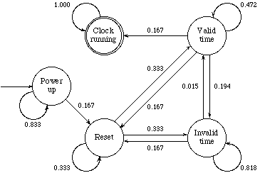
Figure 3. Diagram showing a "non-deterministic finite state machine" model of the microwave cooker digital clock discussed in the text. Imagine a counter placed in the circle called "power up." Each time the user presses a button, the counter follows an arrow to another circle, sometimes the same circle. The aim is to get to the "clock running" circle. The numbers show the approximate probabilities of being able to move the counter along an arrow. Note that once you get to the "invalid time" circle, you are likely to stay stuck there a long time!
It took us about 45 minutes to get it working.
From talking with other people, and from doing our own experiments, our difficulty was not unusual. The only advantage we had by being professors was that we didn't blame ourselves for the problem!
The Genius allowed us to enter any number between 00:00 and 99:99. So we naturally thought that the clock accepted 24 hour times, and since it was then 22:02 hours, we tried setting that time. The microwave seized up; we tried 22:05, 22:15, as time went by, until a lot later we accidentally set the time to 1:00. The clock worked! Having found one way of setting it, we soon realised that we had been misled by the clock: it was secretly a 12 hour clock. (We had a wager about what the user manual would say when we eventually found it. We were both wrong: the manual did warn about the 12 hour clock the problem, but in a footnote!)
We expected the clock to work one way and it didn't. Indeed, it gave us misleading clues that we were right as it could count high enough to be a 24 hour clock. Whilst we were wrong (and the time was pm!) we would never be able to set the clock. This is a simple example of what happens with many pushbutton systems. When users don't understand how gadgets work they are completely stuck. Many people give up on even such "simple" things as digital clocks -- it is easier to have your clock running an hour slow half the year than to adjust it for summer time and run the risk of it going totally awry. Besides, if you have mislaid the manual, you may never be able to set the time.
If manufacturers can't get the design of a simple thing like a digital clock right, what hope is there for all the other pushbutton gadgets? Science is the only solution, even evidence of users misfortune is not sufficient to improve designs: years after The Genius, and presumably a catalogue of users problems with it, the manufacturers are still marketing microwaves containing clocks with identical problems. More recent manuals I have looked at merely mention the problem in bigger writing. The manufacturers have fallen into the fallacy identified so well by Ralph Nader: if users have problems with digital clocks it must be because they haven't read the manual properly. Pah!
Unfortunately it is rather too easy for designers to cheat when they try to understand users. In our digital clock example, the designer might simply assume that everybody uses the 12 hour clock, then there would be no design problem to solve! If, instead, we assume the user presses buttons at random, we are not so much making an assumption about how users behave as admitting that they might behave in any way at all. A "random" model of a user embodies all possible wrong and right ways of using a system. If we have a random user, the designer cannot fall into the trap of assuming too much and thereby being misled.
Now consider the microwave clock. If we asked the designer of the clock how many button presses it takes to set it, he might reply 3 (you press CLOCK, to enter the clock-setting mode, then press 1-HOUR, then press CLOCK again to start the clock running with the new time). If we asked a random user, the answer would be 9.6. This is much larger. Looking at Figure 3 it is easy to see why.
Each circle in the diagram corresponds to a set of states (or numbers that can be displayed) in the actual microwave; because there are only five circles, this is a finite state model; and because we are not being specific about the exact times or displays represented by each circle, we have a non-deterministic model. The game we play is to get a counter from the starting circle "switch on" to the finish, "clock running."
If the user knows what he is doing, he can simply follow the best route. Hence the designer thinks the user will take just three button presses. If the user doesn't know what he is doing, he has no map, he will take different routes with different chances. It is clear that the reason why a purely random user takes so much longer is that it is likely to waste button presses in the "invalid time" circle in the diagram.
What is interesting, however, is that there is absolutely no design reason for this set of states nor the reset state (clock showing 00:00, which isn't an acceptable time either). There is no reason, that is, apart from designer sloth. Removing these states dramatically improves the random user to approximately five button presses (we naturally expect it to take longer than the designers ideal, because, after all, it doesn't know what it is doing). Now a user cannot get the clock to display a "24 hour time" (like 22:02) and so would never be misled as we were.

Figure 4. A modified clock, without a state circle for invalid (including reset) times. Now it is much easier to get directly to the "clock running" circle.
The advantage of a random exploration of a design is that it presupposes no knowledge of the user. A good designer ought to consider the possible wrong ways in which his design might be used (such as the user thinking it is 24 hour instead of 12 hour). A designer can only think of a limited number of misconceptions; a random process, however, embodies all possible wrong ways of using a system. Randomness is, surprisingly, a remarkably effective way of testing out designs. After all, if you paid some human users to test out a design they could only test against their own few and fixed preconceptions: not all possible preconceptions. A "random user" is less efficient than a real user, but it cannot be tricked into guessing the designers secrets.
Suppose that we ask the designer what is the average minimum number of button presses to set the clock, averaged over all clock times. After some thought, he'd say 13.25 presses. The corresponding number for random exploration is infinite -- it can't be done! For any time that we might want to set, there is a chance of becoming stuck forever with a different time; the average over all the possibilities is then infinite. Again we see how psychological knowledge biases the designer to give (dramatically) over-optimistic assessments of his design.
It is very interesting that the random user can set the microwave clock in about ten button presses, whereas I and my colleague took many more. We would have worked out what to do faster if we had simply rolled a dice or tossed a coin! Being random is a better way of getting things to work than having the wrong ideas. This observation explains why children are so much better than adults at operating VCRs. Since they start off with no preconceptions, they press buttons at random. That approach gets results quickly, faster than a systematic approach that an adult would use. Of course, this is an observation about the usability of current designs, rather than the ideal world. Fortunately the observation can be used to test putative designs, and hence lead to improvements. It could have done for the microwave clock.
From the computer science perspective, the problem with The Genius is that its computer program is childishly trivial. There are four digits in the time display, and simply, one button adjusts each digit. The 10-MINUTE button increases the tens of minutes; the 1-HOUR button increases the hours digits. That's all the buttons do. The program is so trivial that 10-MINUTE always increases the tens of minutes, even from 59 to 69, then to 79! Neither 69 nor 79 minutes are valid times by anyone's clock. The programmer, pleased with the neat scheme of every button behaving exactly the same, has forgotten that the only button that should work so freely is the 1-MINUTE. The 1-HOUR, in contrast, should not change 2 to 3 if the 10-HOUR digit is already a 1, because we shouldn't be able to change the time from 12 o'clock to 13 o'clock. It is absolutely trivial to get the programming right so that "times" out of the 1.00 to 12.59 window simply cannot be set. This is a standard technique called error blocking, and it is worth stating the principle about it at length:
Errors do happen; therefore at some stage they must be blocked (or you face the consequences). There is a wide range of design choices for blocking errors. The simplest is that the designer does nothing and assumes the user will block errors. Next, there could be an apology in the user manual (such as its saying "don't set 24 hour times") in an attempt to block errors there. Next, the system itself could block the errors in the clock, simply by being programmed so that 4:59 increases to 5:00 rather than to 4:60. Best of all, the design can be carefully thought-out so that errors are far less likely and, when they do happen, are circumvented by programming. Nader's parking brake mentioned earlier makes a good case study of design choices in error blocking. The American Association of Casualty and Surety Companies would have had us believe error blocking should occur in the driver, which in turn depended on the driver learning what the error was and taking appropriate action, specifically to apply the foot brake simultaneously with the parking brake. However, error blocking can occur elsewhere: it can and will most effectively occur in the design stage, like designing the parking brake itself to work properly. Thus errors can be blocked even before users (or drivers) are involved!
The problem with the microwave clock is that it doesn't block errors. Indeed it should have been designed so that the errors simply couldn't happen. The user need not be aware of "error blocking" at all.
The consequences of a badly set microwave clock is "merely" that the time it shows is wrong. In many other situations trivial design flaws can be fatal.
The design company IDEO designed a blood pressure monitor. IDEO's designers initially made the pressure level setting buttons for the Paramed Arteria adjust the pressure "easily" by having one button per digit, like the microwave clock. Being good at ergonomics, they decided to test whether their design idea was any good for the final users, the medical staff. Experiments revealed, as is obvious with hindsight, that changing the number so easily was too dangerous. It was unacceptable for a nurse to be able to set the blood pressure level out by 100mmHg as would happen with a design like the microwave clock, where pressing 10-HOUR instead of 1-MINUTE has an immediate and huge effect. The monitor was redesigned so that only two buttons were used, one to increase and one to decrease the pressure level. If, now, the nurse really wants a high upper limit they will really have to try to get it by holding the button down for a long time. It is no longer possible to make huge errors easily and too quickly to notice.
In the original clock the 10-HOUR button "ought" to increment the tens of hours, causing errors: 10:00, 20:00, 30:00. With the increment/decrement design, it becomes natural for the time to increase from 10:00 to 10:01. No errors are possible. Indeed, this is exactly how all analogue clocks have been adjusted for centuries! They had knobs, with better affordance than buttons, for doing it.
One of the advantages of science, by definition, is that a good theory has wide applicability. We have sorted out how to analyse and improve all number setting gadgets, blood pressure monitors or digital clocks, whether they are on microwave cookers, car telephones, or your wrist. From the success of our design exercise we infer that the clocks manufacturers didn't use ergonomics; they couldn't have tested the design on users. They didn't use computer science either. The finite state machine shown in Figure 3 makes the invalid time circle look incongruous. Finite state machines are the simplest sort of computer model, and if the designers did ever draw such a diagram it's inconceivable that they would have left the user interface in such an appalling state.
The state of the art is to ignore science -- whether human, like ergonomics, or theoretical, like computing -- and instead be driven wholly by marketing. The only gestures towards improved usability are to have extra buttons to solve problems that should never have arisen in the first place. If you think our pushbutton world is frustrating, just wait till next year! There will be new incomprehensible gadgets in the shops; there will be more complex bank cash machines; the electronic games children play will be even more addictive and impossible for adults.
Nader's contribution to car safety was in raising peoples consciousness of the dangers, the unnecessary designed-in dangers of cars. With hindsight we can now clearly see that drivers were being exploited. But at the time, drivers didn't know any better, and the market had vested interests in keeping cars unsafe. Nader's book gives the full story; his story could now be updated to take on the whole pushbutton world. Manufacturers seem happy to keep on selling us difficult to use gadgets and to encourage us to believe it is our fault we can't use them effectively. With car safety, car designers hoped that drivers and passengers could evade physical laws. They can't -- unrestrained they smash through the front window in a head-on accident. With pushbuttons, designers hope that users can evade laws of computer science, physiology and psychology. They can't -- they get frustrated. Some things are unusable however clever you are, just as some 1960s cars were unsafe however skilled a driver you were.
The car industry stopped being so complacent when consumers, the drivers, realised that the manufacturers could be blamed for almost all of their problems. When a Corvair rolled over, that was not the driver's fault, but a design fault. So, too, when you have trouble with your video recorder it is not your fault but a design fault. As we saw with the microwave cooker example, many design faults can be recognised and fixed even while the plans are on the drawing board. There is science to help manufacturers design things properly, they just need us to motivate them to start using it.
Brenda Laurel, editor, The Art of Human-Computer Interaction, Addison-Wesley, 1990. This book will serve to introduce the Apple Macintosh (compared favourably with pushbutton technology here) and to raise some of the background and design considerations that went into it.
Ralph Nader, Unsafe at Any Speed, Pocket Books, 1965. The classic expos of poor design in the car industry. Although the book is now thirty years old and, in many respects, achieved its goals with the establishment of the consumer movements, it could be brought up to date by replacing the word "car" with "pushbutton technology"!
Donald A. Norman, The Psychology of Everyday Things, Basic Books Inc., New York, 1988. Called POET for short, this book argues that the reason for our mistakes is invariably bad design. The book is readable and fun; its serious message is that a better understanding of humans is an essential part of design.
Dick Powell, Presentation Techniques, 2nd edition, Macdonald, 1990. This book will provide insight into how products are designed, and the influence of graphic artists in the final form of products.
Harold Thimbleby, "Can Humans Think?" The 1991 Ergonomics Society Lecture, Ergonomics, 1991. Expands on the principles discussed in this chapter and looks towards the future impact of interactive home entertainment with multimedia systems.
Harold Thimbleby, "The Undomesticated Video Recorder," Journal of the British Kinematograph, Sound and Television Society, volume 72, number 6, pp214-216, 1991. If you need evidence that video recorders are ridiculously and badly designed, this short paper takes you through specific design faults.
Harold Thimbleby, User Interface Design, Addison-Wesley, 1990. This is probably the only technical book on user interface design, aimed at technically competent designers.
Harold Thimbleby and Ian H. Witten, "New Techniques for User Modelling," in Advances in HCI, volume IV, edited by R. Hartson and D. Hix, Ablex, 1992. Provides a complete discussion of the microwave clock example.